Subscribe to Our Newsletter
Hear more from Equity Methods: Your trusted partner in equity compensation excellence.
CEO pay ratio disclosure is at hand. And with that, companies are finding many difficulties beyond identifying the median employee and calculating the ratio. Understanding what your pay ratio is—and conveying it to others, inside or outside your organization—provides a second, potentially more sensitive set of challenges to consider.
The good news? We’ve found that analytics are effective at explaining the pay ratio calculation. Of course, each stakeholder can have different concerns. For example:
Whatever the concerns, data can tell the story. Here are three examples.
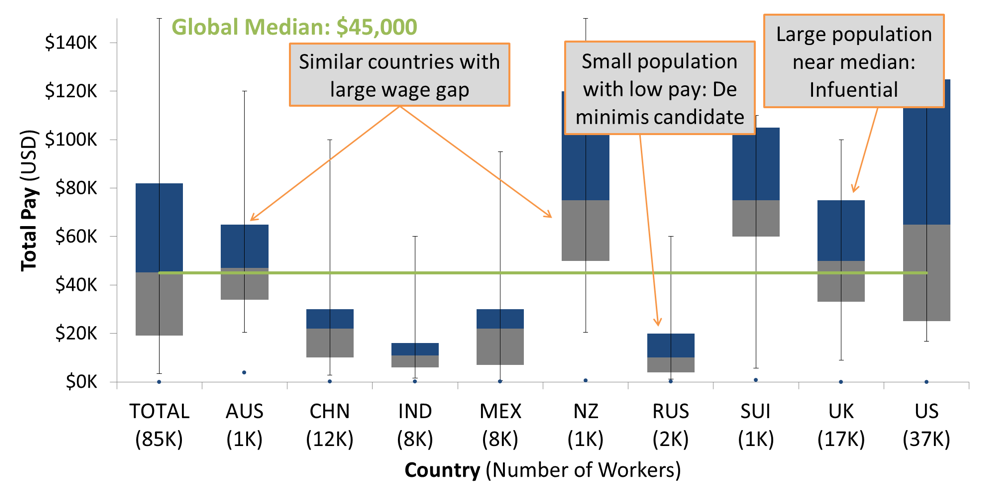
A box-and-whisker plot shows the breakdown of the whole employee population. Each subgroup is paid relative to others. This helps to show where influential populations are, compare the wages of similar groups, and revisit international pay leveling. Populations can be broken out by meaningful categories such as geography, job type, or—for those looking to get a head start on the next wave of pay analysis—gender.
Here, the boxes represent the middle 50% of each group, and the “whiskers” stretch from the 5th to 95th percentile. The gray meets the blue at the median for each group.
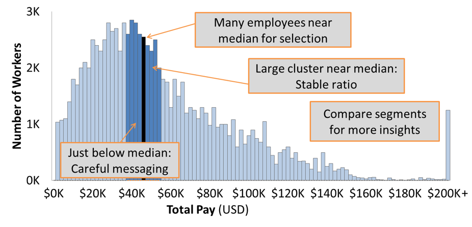
A histogram can show the distribution of all of a company’s employees. This one includes clusters of employees as well as how much the median and ratio could move by adding or removing a given number of employees from the analysis. Also, this can help HR identify the range of employees who might be most concerned about pay at or below the median.
This histogram identifies the number of employees in each $1,000 block of pay, and highlights the section containing the median and those within $5,000.
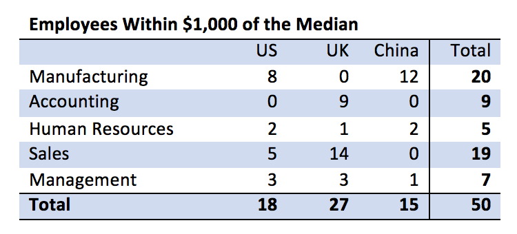
A crosstab is a quick and useful way to identify the group of employees close to the median. This can help to find the most appropriate median based on factors such as wage and bonus stability, similarity of comparable employees (in case the median leaves or is promoted), and ability to determine whether any populations might have pay components not captured in the analysis.
As companies work toward a comprehensive solution to their pay ratio disclosure, we continue to expect novel ways to convey the data to stakeholders. Taking the time to understand your company’s needs and ways to meet them can head off problems before they appear.
Need help calculating your pay ratio or following up the calculation? Please reach out. We’d be happy to discuss your needs.