Subscribe to Our Newsletter
Hear more from Equity Methods: Your trusted partner in equity compensation excellence.
Item 402(v)(5) of the SEC’s pay vs. performance (PvP) rule requires companies to provide a “clear description” of the relationship between compensation actually paid (CAP) and certain other metrics. These relationships must be delineated for the principal executive officer (PEO) and the cohort of non-PEO named executive officers (NEOs). The rule also requires a clear description of the relationship between the company’s total shareholder return (TSR) and a peer TSR metric. (Smaller reporting companies benefit from some exemptions.)
This is the first of a three-part series on how to approach Item 402(v)(5) relationship disclosures. You can find Part 2 here and Part 3 here.
Pay vs. performance requirements hit SEC registrants on August 25, 2022. Since then, roughly 4,000 publicly traded companies have been sprinting to understand the rule, develop execution plans, engage vendors, and fit this tremendous undertaking in with the rest of their year-end activities.
As of January 2023, most calendar-year companies have formed action plans, and many have even drafted PvP tables. So what’s next? Among other open items is the decision on how to approach the Item 402(v)(5) relationship disclosures that are required immediately beneath the core table.
Numerous external constituencies could reference—if not weaponize—the PvP relationship disclosure. That makes it important to have a strategy for disclosing relationships under Item 402(v)(5). The strategy should reflect the nature of the actual PvP relationships in play. It should also take into consideration internal and external factors, such as how other dimensions of the proxy are approached and the possibility for shareholder controversy.
A clear description may use visuals, narrative commentary, or a combination of the two. Companies may also group some of these relationship descriptions as long as the result of doing so is clear. In this article, we review how to analyze PvP relationships and introduce some of the relationship types we’ve seen in practice.
The first step in describing PvP relationships is to understand exactly what you’re disclosing. All told, seven relationships need to be discussed under Item 402(v)(5).
For the PEO:
For the average of non-PEO NEOs:
For the company:
These relationships must be shown over the covered period, so it’s quite possible that a relationship will appear intuitive for one year, then collapse in a subsequent year. It’s also likely that some data points will be finicky, leading to relationships that range from quirky to downright illogical. And that’s with only three years of data populating the PvP table. Soon it will become five years—which means an even bigger window for finicky variable relationships.
So before you can structure the disclosure, you need to understand the underlying economics. That way, you’ll know which PvP relationships are easy to disclose and which ones are tricky—not to mention which relationships will behave neatly at first but get messy over time. It matters because a lack of context could lead the reader to a flawed conclusion on a topic that is bound to draw scrutiny from the media, certain investor classes, and even internal executives.
Beyond that, senior management and the compensation committee value having a spectrum of alternatives with their pros and cons spelled out, even if a particular answer is most likely the right one.
Against that backdrop, let’s dive into the mechanics of how PvP relationships can manifest and how to best interpret these relationships using mathematics and visualization.
A picture may tell a thousand words, but the story it tells isn’t necessarily right. To effectively convey PvP relationships, we need a set of visuals that cut to the core.
In the examples that follow, we focus on TSR as the performance variable since it will generally matter the most. But don’t forget that part of what makes this disclosure tough is that it spans three company performance variables, not just one.
The most common visualization method is a dual axis bar and line graph like the one in Figure 1. This visual establishes an initial vertical axis to plot CAP and a secondary vertical axis to plot the performance variable. The horizontal axis, fiscal year, is shared by both vertical axis variables. CAP can be shown using a bar graph since this is a discrete variable, and TSR can be shown as a line to give a better contrast to CAP.
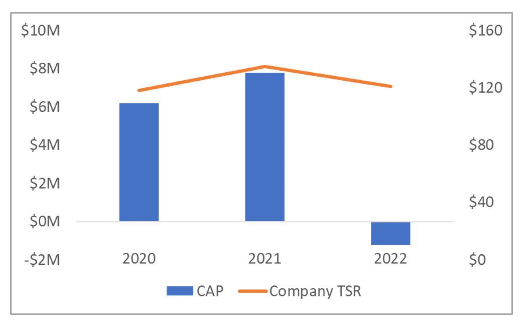 Figure 1: Basic Dual Axis PvP Relationship Graph
Don’t forget your stylistic touchups, such as data labels and font formatting, as shown in Figure 2.
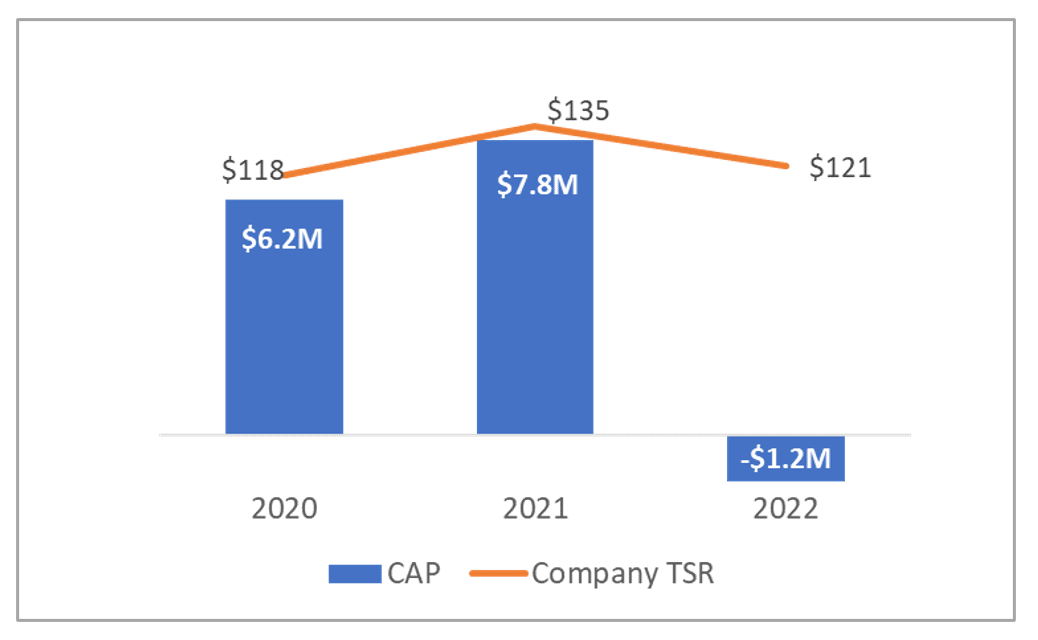 Figure 2: Enhanced Dual Axis PvP Relationship Graph
This type of graph may be the most visually appealing for the proxy, but it leaves something to be desired when it comes to precisely assessing variable relationships. A better approach, at least for internal analysis purposes, is to compare the slopes of the variable lines and their percentage changes, as in Figure 3. This lets us hone in on variable sensitivity—how an X% change in a performance variable translates into a corresponding percentage change in CAP. If, for example, the TSR performance variable changes by negative 20% but CAP rises by positive 30%, perhaps something is askew in the variable relationship.
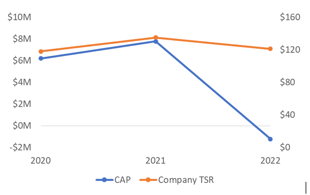 Figure 3: PvP Slope Analysis Graph
As you can see in our example, the slopes are markedly different in 2022 when the rate of change in CAP vastly exceeds the rate of change in TSR. They’re moving in the same direction, but their slopes are much different. This insight makes it easier to decide the best way to present the relationship description because it shows how external or internal parties could draw problematic conclusions.
We like a graph like Figure 3 that’s easy to eyeball but still resembles the type of graph that’s likely to be used externally. Another approach is to explicitly compare the percentage changes in each variable as Figure 4 does.
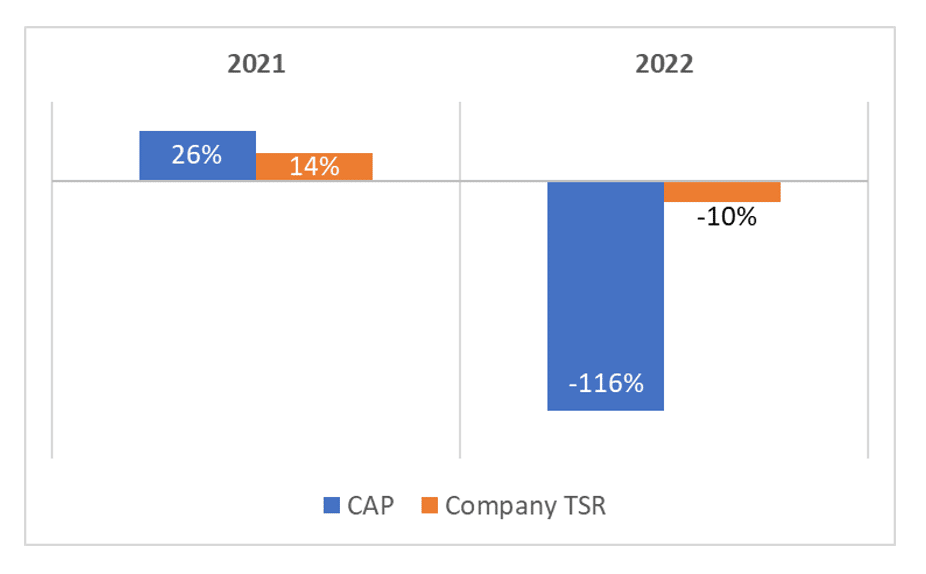 Figure 4: Variable Percentage Change Comparison
Next, let’s look at some of the different types of PvP relationships we’re seeing in practice. We’re going to focus on the relationship between the PEO’s CAP and company TSR, bearing in mind that the interplay across relationships matters. The points that follow apply to all variable relationships.
No two PvP relationships are the same, but across hundreds of actual cases, we’ve found most fall into six buckets.
Every company hopes that movements in CAP are relatively proportional to movements in the respective variables. If they do, it shows that the company’s PvP philosophy works well because executive compensation evolves in lockstep with organizational performance.
The chances of this relationship holding up across net income, the CSM, and TSR is unlikely. Still, one would hope it holds up for the CSM and TSR. The CSM should be the most important metric in the current year’s incentive plans; movement in the CSM should mechanically flow through to changes in CAP. TSR should also closely influence CAP since a majority of executive compensation is delivered via equity.
Figure 5 shows an example of a tight variable correlation.
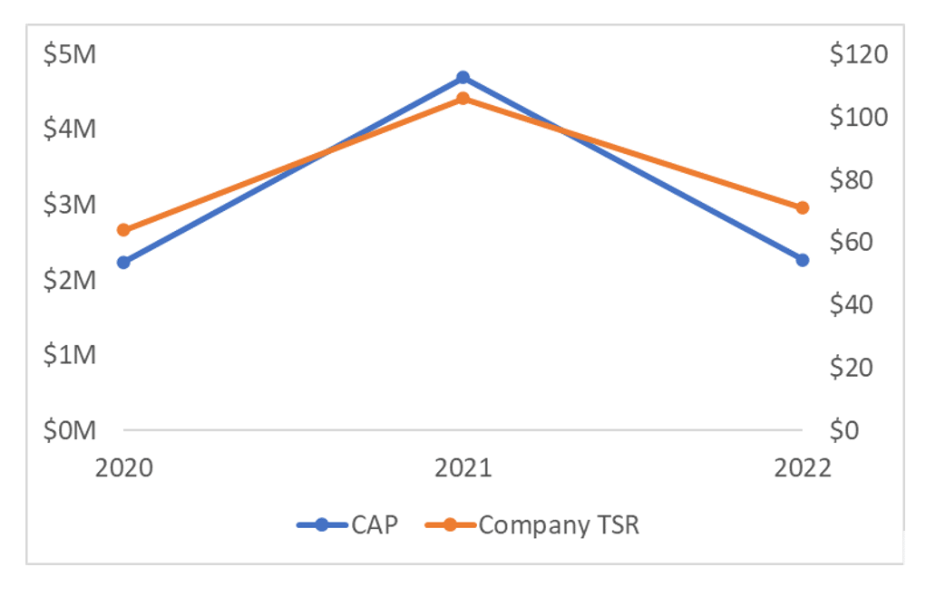 Figure 5: Tight Variable Correlation Case
Since we’re studying the slopes to understand the relationships better, we’re going to roll-forward the graphical construct of Figure 3. This is an internal analysis to help us decide whether to use graphs, narrative commentary, or both in the public disclosure.
If we decide to use graphs, something like the slope chart in Figure 5 would be reasonable. However, we suggest a more visually compelling chart like the one in Figure 2.
A case we’re seeing especially frequently is one where CAP is hyper-responsive to changes in TSR. This is especially common for the CAP-to-TSR relationship but could manifest across the CSM and net income relationship analyses too.
We’ll start with the slope analysis because this really brings the relationships into focus, as Figure 6 shows.
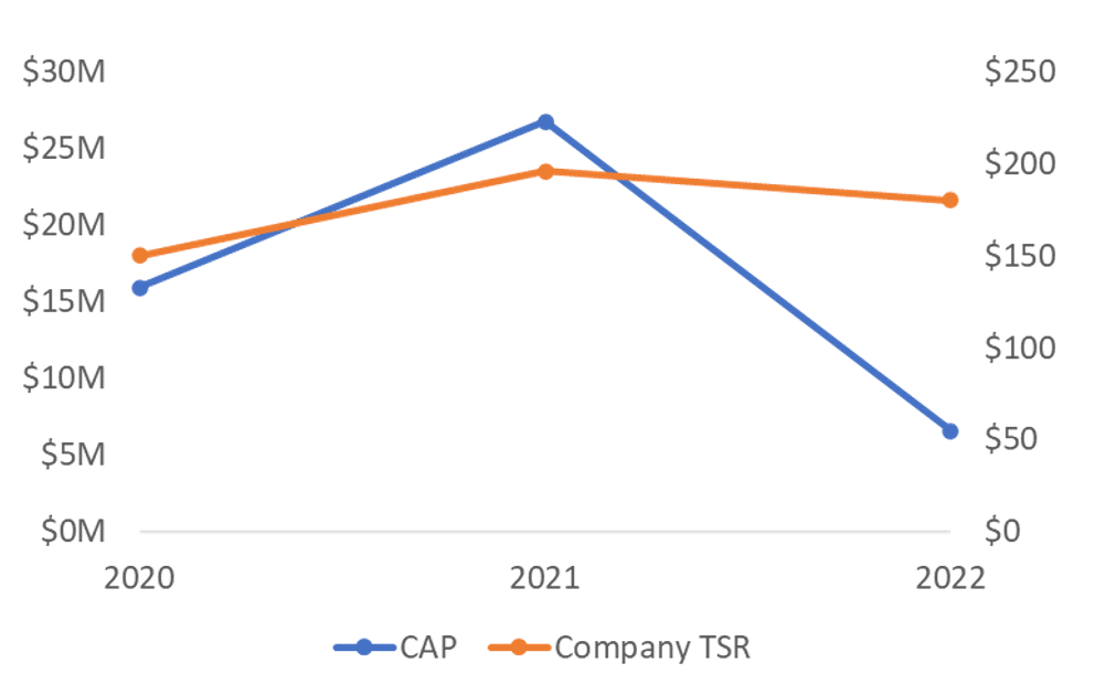
Figure 6: High Sensitivity PvP Relationship
In this example, TSR decreases slightly in 2022 and is still well above the $100 watermark, suggesting shareholders are faring quite well.
Nonetheless, there’s a seismic drop in CAP. CAP is extremely sensitive to even a small change in the share price, or so it seems. We always need to dig beneath the surface. CAP’s severe decline could stem from factors other than the share price, such as a large award dropping out of the calculation. Root cause and attribution analysis are critical anytime you’re dealing with complex variable relationships.
In a case like Figure 6, perhaps there’s nothing risky about the disclosure since it clearly shows that pay is ultra-responsive to changes in TSR. But what if the relationship went in the other direction and CAP spiked in response to a modest uptick in TSR? Would shareholders criticize the pay program for motivating excess risk-taking or the pursuit of volatility? This is why understanding the nature of the PvP relationship is necessary to selecting the best strategy for disclosing it.
Drilling into the PvP relationships can also clarify the types of risks associated with the disclosure. In high-sensitivity cases like the one in Figure 6, the punishment may not necessarily fit the crime. Does a modest drop in TSR merit a full-blown collapse in CAP? The risk might not even be with shareholders, but rather, NEOs who look at the disclosure and wonder if it’s appropriate that their pay is so hyper-sensitive to the share price.
Occasionally we see cases that we call “no pay for performance,” meaning performance is quite good yet CAP is declining. This scenario usually happens with net income, but it’s also possible with TSR if relative performance metrics are used that pay out below target despite healthy absolute performance. It should be least likely in the CAP-to-CSM relationship since the CSM, by construction, should be correlated with CAP.
Unfortunately, another cause of this scenario is circumstantial, such as lumpy granting patterns whereby older grants exit the equation without a new grant to bring CAP up. Stock price volatility can also result in a low vesting date value (causing a negative entry to CAP) even though the share price recovers by fiscal year end (causing a higher TSR depiction). The point-to-point measurement framework fails to pick up Intra-year TSR volatility.
In short, studying the variable slopes doesn’t explain what the driver is, but it does help you know what drivers to look for in the underlying data.
Figure 7 provides a more extreme illustration of this variable relationship.
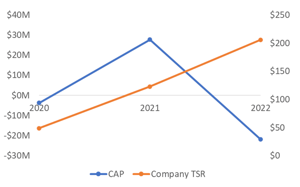
Figure 7: No Pay for Performance Relationship
In this case, the starting TSR performance is poor, as the $100 investment declines to about $50 and CAP starts out negative as a result. TSR rebounds and so does CAP in 2021. In 2022, TSR continues its ascent but CAP collapses. The causes are the use of cash-based awards and relative TSR. The improved TSR performance doesn’t help cash-denominated awards rise in value and relative performance was down in 2022 despite absolute TSR being robust.
Disclosing this type of relationship starts with a crisp understanding of how a graphical rendition could be construed adversely, the driving factors, and how a more elaborate approach could mitigate those risks (if at all).
The dreaded relationship is the one that shows growing compensation amid declining performance. This can happen for a number of reasons, such as the use of non-rigorous goals or performance metrics that are disconnected from those investors care about. The textbook example is a growth company using efficiency or profitability metrics that are achieved only by cannibalizing future growth opportunities.
The company may hit its metrics but get punished by the market as valuation multiples decline. This scenario would manifest most strongly in the CAP-to-TSR relationship.
Figure 8 illustrates a case where a company uses return on invested capital as its primary performance metric and has a history of paying out between 150% and 200%. The high payout multiples, coupled with a high base salary and bonus, more than offset the effect of a declining share price.
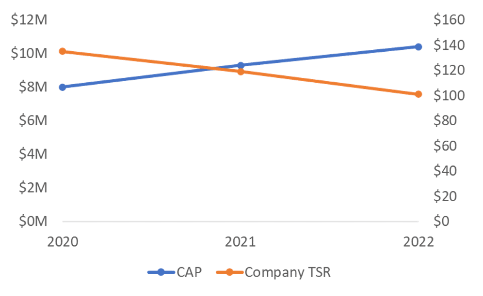
Figure 8: Pay For Low Performance Relationship
A random relationship is one with no meaningful correlation to talk about—the PvP relationship could have been constructed by throwing darts. We suspect random relationships may become common once there are five years in the PvP table. If so, it usually won’t be due to broken compensation programs or poor metric design. More likely, the cause will be too many moving parts for relationships to follow tidy patterns.
Most companies will see random CAP-to-net income relationships given all the non-operating items hitting net income. But the hope is that CAP-to-TSR and CAP-to-CSM are anything but random. Figure 9 shows an example of a random CAP-to-TSR relationship.
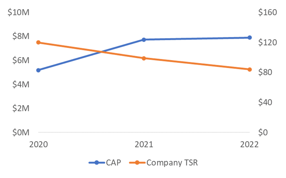
Figure 9: Random PvP Relationship
A company with this type of graph may conclude a graph isn’t the most appropriate medium because it says too much about the relationship (or lack thereof). Alternatively, a graph may be appropriate so long as there’s context on why the relationships appear to be random.
Any company with atypical granting activity (think mega grant or new CEO onboarding grant) will encounter a unique set of variable relationships. In 2020 and 2021, many newly public companies often granted outsized awards, usually in the form of price-vested options or PSUs. These grants may have been in lieu of, or addition to, subsequent annual grants. Either way, they’ll introduce volatility into company PvP relationships.
Remember how the calculation of CAP involves setting up the baseline value in the year of grant, in which the full award value at fiscal year end is used (unless the award vests or forfeits in the year of grant). Thereafter, all that matters are changes in value. This means that year one will have an outsized effect, as will subsequent years involving high volatility. Figure 10 provides an example.
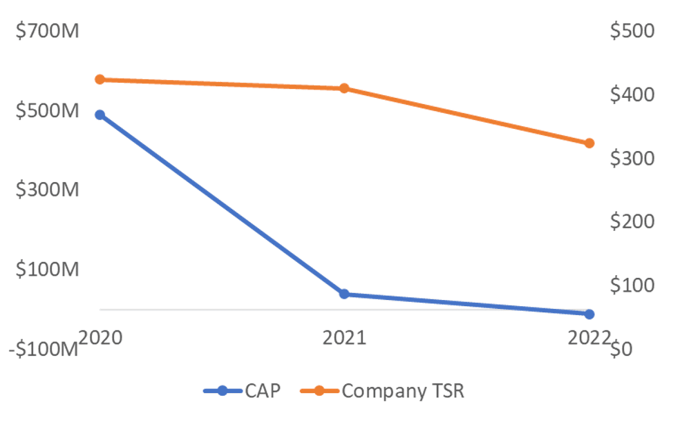
Figure 10: Entry and Exit Driven PvP Relationship
The mega grant made in 2020 causes CAP to begin at almost $500 million. The value of a $100 investment in the stock on December 31, 2019 also jumps to over $400 by the end of 2020. CAP drops markedly in 2021 even though the stock price is relatively unchanged. The drop in CAP isn’t overly linked to changes in the stock price, but rather a return to annual granting. The next drop in CAP in 2022 is, however, linked to the stock price decline as a larger revaluation of the 2020 mega grant triggered a large negative adjustment.
In this particular case, the compensation program is working quite well. The graphing effort helps put together the narrative, in which case a basic graph may be sufficient but benefit from some brief analysis. But it’s up to the company, since the PvP rule doesn’t require analysis and justification.
We’ve seen the gamut of ordinary and extraordinary PvP relationships from our work with hundreds of companies. We’ve also been party to many discussions on how to approach the disclosure, from ultra-minimalist to context-rich. The six types of PvP relationships we’ve just examined stand out as the most common so far. Of course, in the real world every case has its own nuances—especially when you look at the TSR, CSM, and net income relationships collectively.
Even with the view that the PvP disclosure is purely a compliance exercise and the content isn’t of interest to investors, management and the compensation committee will want to understand why the relationships appear the way they do. What are the drivers? What assumptions are guiding the outcomes? The visualization exercises we ran through here help bring insight to these types of questions.
In the next installment, we look at different disclosure archetypes—from a minimalist graph-only approach to a combination approach that selectively uses narrative alongside graphing. The third and final article shares considerations in deciding which archetype to adopt.