Subscribe to Our Newsletter
Hear more from Equity Methods: Your trusted partner in equity compensation excellence.
Item 402(v)(5) of the SEC’s pay vs. performance (PvP) rule requires companies to provide a “clear description” of the relationship between compensation actually paid (CAP) and certain other metrics. These relationships must be delineated for the principal executive officer (PEO) and the cohort of non-PEO named executive officers (NEOs). The rule also requires a clear description of the relationship between the company’s total shareholder return (TSR) and a peer TSR metric. (Smaller reporting companies benefit from some exemptions.)
This is the second of a three-part series on how to approach Item 402(v)(5) relationship disclosures. You can find Part 1 here and Part 3 here.
We kicked off this series with an introduction to some of the more common types of PvP relationships because it’s hard to discuss how to disclose something until you understand what it is you might be disclosing. (In fact, we expect some companies to encounter frequently changing PvP relationships year over year based on stock price volatility, diverse award designs, and executive entry and exit.)
Now it’s time to talk strategy. When we work with companies on PvP relationship disclosures, we mock up a range of disclosure strategies using our client’s data, then spell out the pros and cons to aid decision-making. Even when the core client project team has a pretty good sense of what approach they’d like to take, the broader stakeholder group often values understanding the alternatives available and what the key tradeoffs are. Here are six archetypes that are usually on the table.
This is the minimalist strategy and the one we believe will be most prevalent. Graphs are easy and, with some elbow grease, they can be made to look quite nice. From a risk perspective, it’ll be hard to argue that a reasonably prepared graph doesn’t meet the criteria in Item 402(v)(5) or is misleading.
On the other hand, a graph is void of context and invites the user to draw their own conclusions without any guidance as to what’s going on behind the scenes. In Part 1, Figure 8 shows a “pay for low performance” relationship. For the purposes of that analysis, we were studying the slopes. But packaging it up for external use doesn’t make the story any less disconcerting, as we show in Figure 1.
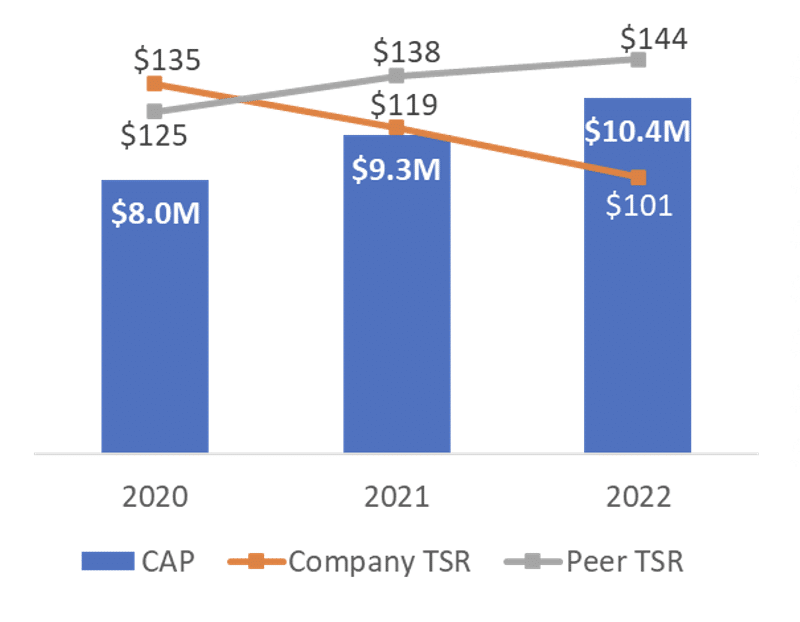
Figure 1: Pay for Low Performance Graph
It’s hard to make this graph look good because the underlying numbers are problematic. Dropping this into the PvP disclosure without any context or discussion achieves compliance, but not much more.
On the other hand, the “tight variable correlation” relationship in Figure 2 yields a simple, intuitive message.
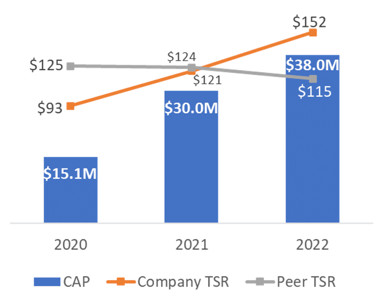
Figure 2: Tight Variable Relationship Graph
As we discuss in Part 3, a clean relationship today can deteriorate into a messy relationship tomorrow. That means studying the graphs as they look today is necessary but insufficient. We also need to consider other decision-making criteria, including the precedent-setting implications of a given approach.
The graphs shown here track CAP and TSR, but we could have just as easily inserted the CAP of the non-PEO NEO cohort. It won’t work to squeeze the other two performance variables, net income and the company-selected measure (CSM), into the same graph. So there will need to be at least three distinct graphs. (Skip ahead to Figure 4 for an example.) Also, we know that many companies won’t include peer TSR in their CAP-to-TSR graph, instead opting to do a fourth graph that only compares company TSR to peer TSR.
There isn’t detailed guidance on how to approach the relationship disclosures and what constitutes a “clear description.” On page 27 of the final rule, the SEC briefly references an approach that looks at the percentage changes in both the pay and performance variables:
Alternatively, the required relationship disclosure could include narrative or tabular disclosure showing the percentage change over each year of the required time period in both executive compensation actually paid and the financial performance measure(s) together with a brief discussion of how those changes are related.
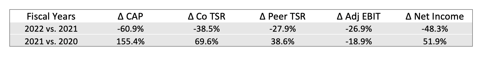
Figure 3: Percentage Changes Disclosure
This dovetails with the slope analysis framework we introduced in Part 1, which speaks directly to the sensitivity of one variable to another. The SEC’s comment suggests a suitable relationship disclosure could be a table that summarizes the percentage changes, like the one in Figure 3.
According to the SEC, something like Figure 3 could be appropriate if presented “…together with a brief discussion of how those changes are related.” The discussion could read something like this:
From 2021 to 2022, our TSR declined by 38.5%, which was a larger decline than that of our peer group. Over the same period, Adjusted EBIT and Net Income declined 26.9% and 48.3%, respectively. Compensation actually paid to our PEO declined by 60.9%, a larger percentage amount than each of these financial variables.
We doubt anyone expects a lengthy or elaborate analysis. Still, reasonable parties can disagree on what constitutes a clear description. Our advice? Don’t be too brief, but also don’t offer more than the rule requires.
Another approach is to dispense with graphs and use only text. Obviously with pure text, there’s a near infinite number of possibilities. We’ll begin with one we don’t particularly like but is the simplest place to start.
The textual table archetype aspires to be as boring as possible by basically duplicating the information in the core PvP table. For example, using the data in Figure 1, the textual table approach may look as follows:
“Compensation actually paid was $8 million, $9.3 million, and $10.4 million in fiscal years 2020, 2021, and 2022, respectively. A $100 investment in our stock on December 31, 2019 would evolve to $125 as of December 31, 2020, $119 as of December 31, 2021, and $101 as of December 31, 2022…”
Although this communicates the same thing as the graph in Figure 1, it doesn’t accentuate the problematic relationship like a graph does.
But we wonder whether this meets the threshold of providing a “clear description” of the PvP relationship, especially given the framing on page 27 of the final rule. A wall of text that just duplicates the core PvP table may not be sufficient. Until bright-line standards become available, we advise against disclosures that yield no incremental information.
Therefore, if there is a preference to use bland text, you can include some information duplicative to that in the core PvP table. But be sure to offer something else that sheds incremental insight into the nature or causes of the variable relationships.
This archetype picks up where the core PvP table of Item 402(v)(1) ends—by explaining the relationships or their root causes. Here’s an example of analysis prose:
As shown in our Item 402(v)(1) table, compensation actually paid has increased each year while TSR has declined. This is partially due to our decision to grow our PEO’s base salary and bonus to market levels. Additionally, our core performance metric, return on invested capital (ROIC) has paid out above target each year as we focus on a multi-year cost cutting initiative.
This approach stands in stark contrast to the preceding one by dispensing with repetition and focusing on insight instead.
The SEC doesn’t say much about what constitutes a “clear description.” But they do note, “We encourage registrants to present this disclosure in the format that most clearly provides information to investors about the relationships, based on the nature of each measure and how it is associated with executive compensation actually paid” (page 27, final rule). From this perspective, an analytical approach may succeed in showing how the nature of a particular measure causes it to relate (or not) to CAP.
However, be careful not to be overly qualitative, which could be construed as failing to provide a clear description. Also remember that the final rule isn’t calling for a clear justification of how pay responds to performance, but rather a clear description of the relationship. We think analysis can accomplish that, especially if it explains why and how a certain counterintuitive relationship has come to be.
The obvious drawback with this approach is that it’s hard to maintain. Each year, new analysis is needed. If the relationships become especially finnicky and inconsistent across variables, it may be difficult to find the right words that are descriptive without masking any of the more awkward nuances in the table.
The difficulty with text is that while a check-the-box, compliance-focused approach could be duplicative or low-value add, the most context-rich analysis may fall short of providing a clear description because it’s overly qualitative or inconclusive. This is where combination approaches can be helpful.
One such approach is to provide a graph like the one in Figure 1 for each required relationship disclosure, then follow with a brief analysis. The graph satisfies the minimum requirement and any additional context is fine as long as it’s not misleading or problematic for some other reason. For example, it would be reasonable to follow the graph with commentary such as:
Although our compensation actually paid is increasing and TSR is decreasing, this reflects a below-market base salary and bonus that has been restored to market levels, in addition to our decision that return on invested capital (ROIC) is a more suitable performance metric for driving long-run value creation in the organization.
In short, with this approach, you can be very targeted in what contextual points to offer. You can also make normative statements because the graphs already satisfy the clear description requirement under Item 402(v)(5).
There are countless variations of combination approaches. The prior strategy involves limited context after each graph. A different approach is to bookend the entire series of graphs with context. This archetype is all about framing, whereby the graphs deliver the core compliance with Item 402(v)(5) and the bookends put it in perspective.
For example, text such as the following could precede the graphs:
The graphs that follow provide descriptions of the relationship between compensation actually paid and net income, our company-selected metric, and TSR for both the PEO and the average non-PEO NEO cohort. The graphs also describe the relationship between our own TSR and a peer group TSR. Compensation actually paid is influenced by numerous factors, including but not limited to the timing of new grant issuances and outstanding grant vesting, share price volatility during the fiscal year, our mix of short-term and long-term metrics, and many other factors.
This lede can be as long or short as needed. The goal is to remind the reader, as they study the graphs, that many factors influence CAP—so don’t be surprised by the occasional spurious relationship.
After delivering the graphs, you may wish to conclude the section with additional framing remarks, such as:
For a review of our performance metrics, our process for setting executive compensation, and how our executive compensation design reinforces our compensation philosophy, please see the Compensation Discussion and Analysis above.
This bookend can be as implicit or explicit as desired, with the above example serving to remind the reader that the compensation committee’s thought process for making pay decisions isn’t described in this disclosure, but in the CD&A.
We’re also aware of some companies that are intentionally using prose to express their disagreement with the theoretical construct underpinning CAP—using assertive or subtle language to express that they don’t believe it’s compensation actually paid. This reminds us of disclosure language on Black-Scholes and how the mandatory option valuation under ASC 718, previously FAS 123R, was requiring the use of option-pricing models that weren’t designed for employee stock options.
We don’t have strong views as to the value of this sort of framing. We do, however, advise not using such language anywhere near messaging that could be construed as a supplemental disclosure. The PvP rule is clear that supplemental disclosures are permitted but must not be misleading or more prominent than the required disclosures. Critiquing the required disclosures and then offering up a supplemental alternative on a silver platter could be construed as violating the prominence standard.
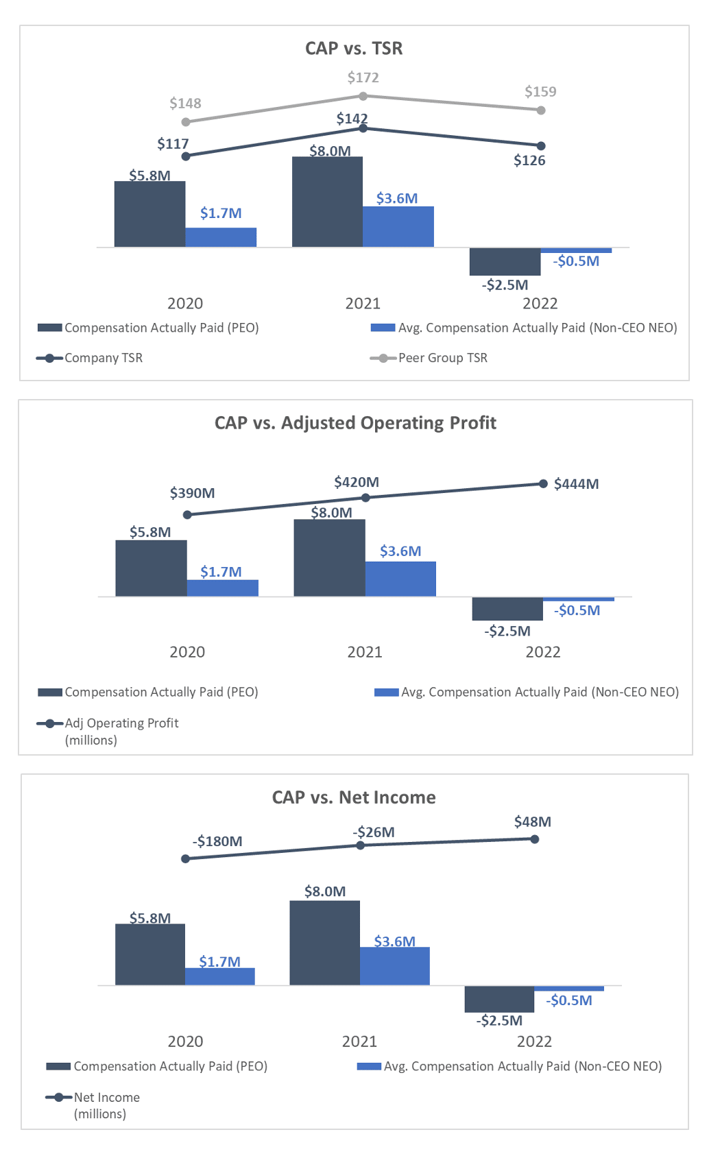
Figure 4: Full Panel of Relationship Disclosure Graphs
Since there are seven relationships to illustrate, graphing could add substantial density to the disclosure. Where possible, we suggest grouping the PEO and non-PEO NEO cohort together. The TSR and peer TSR disclosure can also be grouped. Figure 4 offers an example.
As you can see, graphing takes up a lot of space, but packs a lot of information. It arguably checks the compliance box whereas we think a text-only approach may appear insufficient, unclear, or potentially even misleading. For this reason, Archetypes 4 and 5 include graphing and layer in additional commentary that’s targeted and discrete (and which, on its own, would be far from adequate).
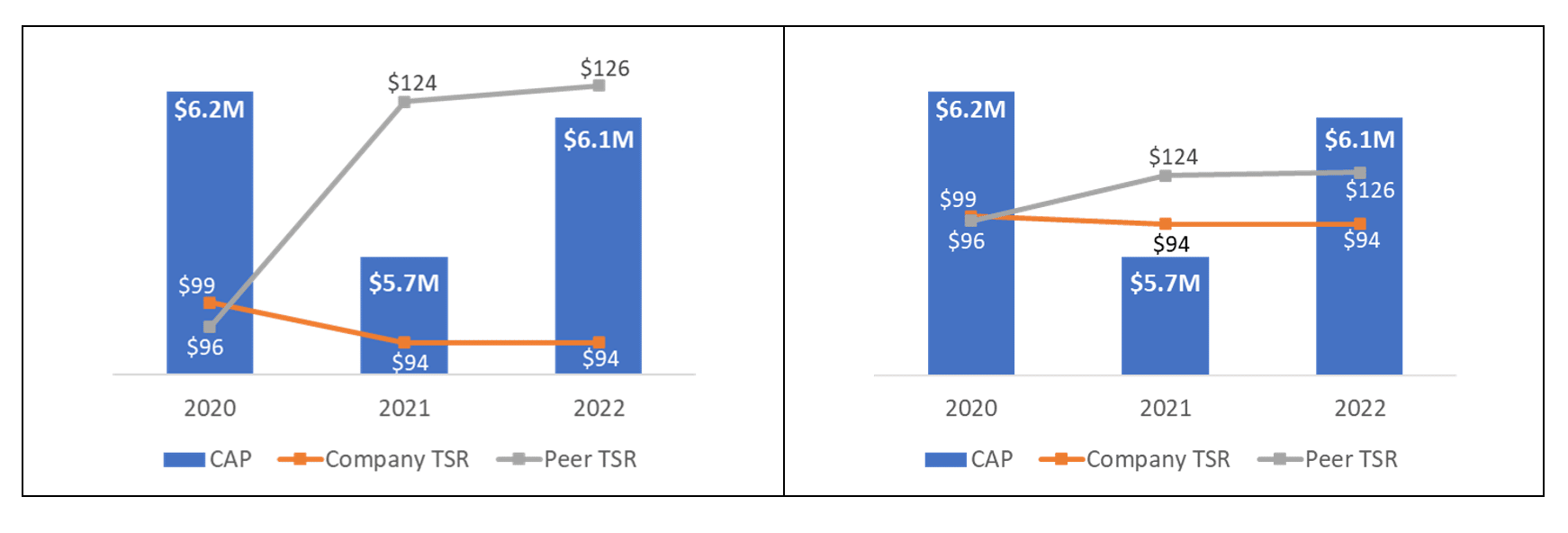
Figure 5: Graphing and Axis Boundaries
There are many reasons for graphical disclosures, with or without text commentary. But graphing does have some risks.
First, a graph doesn’t look elegant on its own. Graphs can easily become cluttered or unclear, especially when dealing with dual vertical axes that capture different variables. When using graphs, be sure to take time to optimize their usability.
Second, even graphs can be misleading. The culprit? Axis boundaries. Figure 5 shows two graphs reporting the same information, but the vertical axis boundary in the second one is different.
The high upper limit in the second vertical axis has the effect of shrinking the wedge between the company TSR and peer TSR lines. This isn’t necessarily wrong, but it does illustrate how small settings can radically reorient a graph’s look and feel.
Be sure to pressure-test the settings and understand how the graphs are being developed so they convey the right story as clearly as possible.
Bear in mind these are six of many potential archetypes. They’re intended to be broadly representative, but don’t let them be constraining. We have many clients using one of these six and other clients using different ones altogether.
The closest we come to a recommendation is that for the first year of disclosure, it will often be best to keep it simple and avoid irreversible decisions and precedents. We expect at least half of companies will use graphs only. Minimalist approaches also confer optionality to make targeted refinements in future years as trends emerge. Graphing on its own will generally check the compliance box as long as the reader can clearly see how the relevant variables relate to one another.
Ultimately, your choice should be deliberate and linked to the risks you’re most interested in managing. In our third article, we share considerations to help you settle on a disclosure approach that satisfies your objectives best.