Subscribe to Our Newsletter
Hear more from Equity Methods: Your trusted partner in equity compensation excellence.
Proxy season is upon us, and with it, the perennial challenge of how to tell a nuanced story clearly and concisely. As we discussed recently, the best way to do this often is with charts and graphs. If a picture is worth a thousand words, then visualization is one of the most effective ways to reign in the proxy statement’s ever-expanding word count.
To inspire those of you putting together your 2018 proxies, we looked back through last year’s filings to find some of our favorite charts. Some are solid examples of more standard graphics, others are more novel, and the rest fall somewhere in between. But they have one thing in common. They all tell a clean, insightful story.
Without further ado, let’s dive in. Click these links to jump straight to one of the examples, or continue below to see all of them.
1. Pay Component Breakdown
2. Performance Award Flowchart
3. Completed Performance Cycle Outcome
4. Alternative Pay Explanation
5. Realized and Realizable Pay
6. Relative Pay to Relative Performance
7. Long-Term Performance Comparison
8. Percent of Profits Paid
9. Negative Discretion
10. Explaining SCT Volatility
To start, let’s look at what has become a very common addition to the Compensation Discussion and Analysis (CD&A) section. That would be the pie or donut chart breaking down the pay components for the CEO or other NEOs. Despite their ubiquity, not all of these charts are created equal. Here’s one very good example, courtesy of eBay:
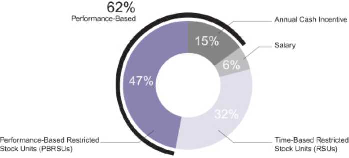
This chart has the elements we’ve come to expect. There’s an inner ring breaking down the percentage of pay for salary, annual incentive, and long-term incentive programs. Then there’s an outer ring highlighting the overall portion that’s performance-based. (Some companies use that outer ring to instead highlight all variable compensation, which would also encompass the RSUs above. Other companies have two rings to highlight both performance-based and variable compensation.)
This chart of eBay’s makes good use of several features.
Direct labeling. The percentages are placed directly on the chart, with clear lead lines spelling out what each slice of the pie represents. This is a vast improvement over having a legend off to the side, which requires readers to jump back and forth to match slices to pay components. (Legends can also be a real struggle for colorblind readers like yours truly!)
Visual polish. Lots of companies have charts that are obvious copy-and-pastes from Excel’s default color and layout settings. However, eBay’s is clean and consistent with the look and feel of the rest of the proxy. (I’m not picking on Excel. It’s a powerful tool that we use all the time, and its default chart settings are fine for internal analysis. But for a public filing, it’s worth going the extra mile to avoid a disjointed look and feel.)
A clear takeaway. Most of the data is represented in cool blues and grays, but “62% Performance-Based” is in big, bold, dark font at the upper left of the chart. Since you’re using your charts to tell a story, make that story obvious.
Our next chart, this one from Mastercard, lays out the structure of their hybrid PSU award:
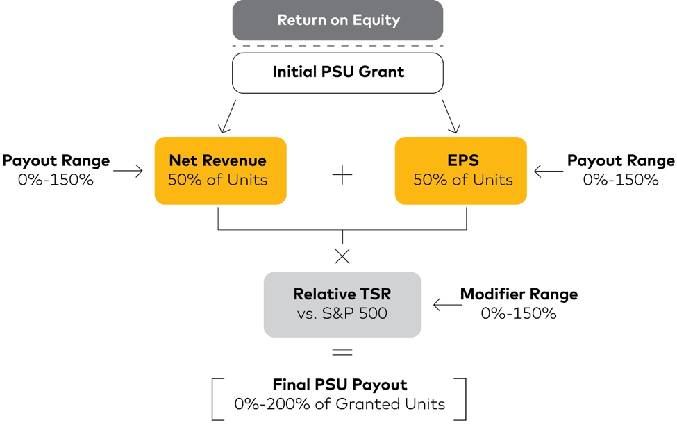
To appreciate the power of this graphic, consider the alternative. Try writing out an explanation of all of the moving parts. You’d have to start with the ROE gateway to fund the award, then move on to the multiple, independent performance metrics, which are then modified by relative TSR (total shareholder return), all of which is capped at a 200% payout. It’s enough to make your eyes glaze over, even before you get into the details.
Instead, Mastercard conveys all this via a simple graphic. No fancy animation or special software is necessary. Clean lines, thoughtful use of color, and font weight are all it takes to make the story easy to understand. As a bonus, in the proxy this chart also has a few concise bullets alongside. That adds an extra layer of detail without diminishing readability.
To report the payout results of just-completed performance award cycles, companies have commonly used dense tables or text. These can be confusing—just think about all of those relative performance awards where a result in the nth percentile gives a payout of X percent. This piece of the disclosure cries out for a graphic. Thankfully, more companies are heeding the cry with charts like this one from Intuit:
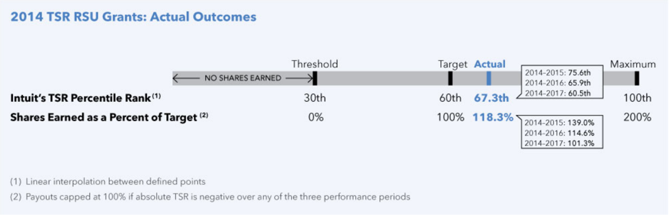
It’s a simple horizontal line going from minimum achievement to maximum. The payout schedule is clearly broken out with performance levels and corresponding payout levels. Then, using color to highlight the key piece of the picture, the actual outcome is laid out alongside the actual payout level. These charts are simple to make and simple to interpret. Because they don’t take up much vertical space, they’re an efficient way to summarize even the most complex, multi-metric plans.
Moving away from data or process flow, our next example shows another valuable use of graphics: organizing text. Let’s take a look at how United Technologies used a visual text layout to explain alternative pay definitions:
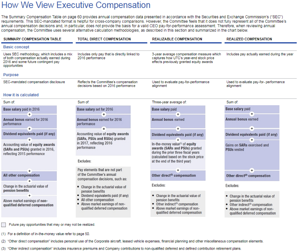
Given the inherent shortcomings of the Summary Compensation Table (SCT) definition of pay, alternative pay frameworks like total direct compensation, realizable compensation, and realized compensation are wildly valuable. But these frameworks are often confusing to proxy readers since companies tend to define them differently. Also, companies have a habit of burying their definitions in a footnote, making understanding and comparison that much harder.
United Technologies puts the topic front and center. For each definition of pay, everything a reader needs to know is right here: what it is, why it’s useful, and how it’s actually calculated. We especially like the explicit notes about what pay components are excluded from each framework. That way, readers don’t have to cross-compare the columns.
Sometimes text—not a picture—is the answer. This is a great example of how to use layout and brevity to make the text as useful and digestible as possible.
Continuing with the theme of alternative pay frameworks, this chart from KeyCorp is an example of their use in action:
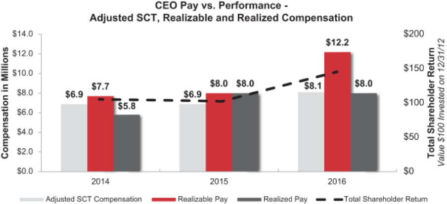
Notice how much information is packed into one picture. It shows three different definitions of pay, along with total shareholder return. And while the information is dense, the chart achieves clarity thanks to a few important design choices.
First, pay columns are directly labeled to give readers a quick comparison of actual figures. The TSR, on the other hand is not directly labeled. Not only might squeezing more numbers into the middle of the chart make it more confusing, but the important story with TSR is the trend, not the exact numbers.
Second, realized and realizable pay are shown in darker colors that draw the eye. By contrast, SCT pay uses a lighter color to act as more of a reference than a focus.
The next chart takes us into waters that are a bit more…uncharted. (I’ll show myself out.)
Here, Bunge takes an angle that not many companies do in their proxy—showing their realizable pay to peers alongside their performance compared to peers:
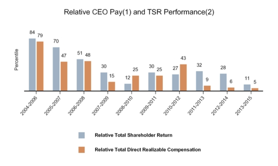
We’re all used to seeing scatterplots of pay vs. performance percentile. Those are the ones where being near the middle diagonal means good alignment, higher indicates a problem, and lower might signal retention risk. Bunge takes that concept a step further here. This chart strips out other companies’ positions to focus on the company’s own realizable pay and performance rankings. Then it extends this information over the last 10 performance cycles.
According to the chart, while individual cycles ebb and flow, there’s a good long-term correlation between performance outcomes and pay outcomes. Moreover, there’s no systematic pay-for-pulse issue. This chart would be even better if it had true realizable pay for every peer. That’s unfortunately impossible without knowing the details of how peers’ midstream awards are tracking relative to goals, which is rarely disclosed. So Bunge instead uses a transparent, reasonable set of assumptions to portray the long-term trend.
The long view is also the theme of our next example, this one from McKesson:
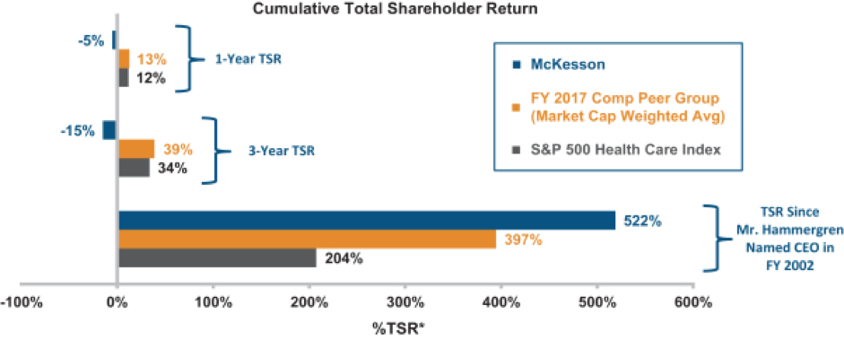
McKesson found itself in the unenviable position of having high CEO pay along with lagging performance in recent years. The primary reason for the CEO’s pay, though, was the value he had created over the long run. So, McKesson used a chart to highlight that long-run outperformance. It shows a 500% cumulative return during the CEO’s tenure, far outstripping industry returns.
While apparent pay-performance disconnects are always going to require delicate messaging, sometimes graphics can help shed new light on your story.
JPMorgan Chase gives another great example of telling a pay-for-performance story through a different lens:
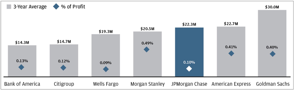
At a glance, the company’s compensation seems above average for their peer group. Many companies would default to a narrative about how the pay is appropriate given the size and complexity of the business, etc. But that argument isn’t bulletproof. For example, JPMorgan Chase has about the same assets and revenue as Bank of America, yet pays over 50% more.
Instead, this chart focuses on percent of profit—that is, the portion of value created that actually gets paid out. And by that measure, the company shows they’re much more efficient than peers with similar pay. They’re even better off than their lowest-paid peers.
Visually, the chart is also easy to read and understand. The company directly labels all of the data points, avoiding a vertical axis that could distract readers. And the use of a bolder color for their own data automatically draws attention to that part of the chart, making the takeaway clear.
With Wells Fargo’s culture and sales practices under the spotlight in 2016, the 2017 proxy had an extra job to do. It needed to deliver a clear message about change:
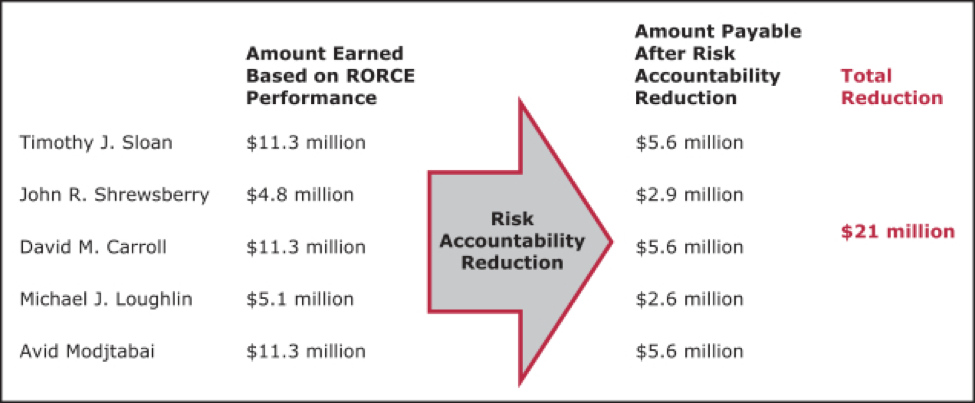
Useful visuals don’t always need flashy bars, pies, or colors. The key is to tell a story concisely, with graphics that draw reader attention to what matters most.
Here, the intent is to strongly convey that executives’ pay was meaningfully cut due to the year’s events. The company does this simply, stating the numbers before adjustment, a big red arrow, the numbers after adjustment, and bold red text with the amount of money redirected from executive wallets.
Let’s end this post on a higher note. In another unique company situation, Hewlett Packard split into two companies in late 2015 (their fiscal 2016). A result of this was that the CEO of the remaining company saw her SCT pay fluctuate wildly in the year prior, year of, and year after the transaction. The company wanted to explain this fluctuation in a way that portrayed an underlying stability:
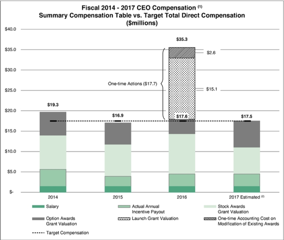
Since this proxy covers fiscal 2016, the SCT appears to show a massive raise for the CEO. However, this is due primarily to one-off events related to their spin transaction, including a special grant and an incremental accounting charge.
The company uses this chart to portray ordinary pay components in solid colors, with the columns stacking right near the horizontal dotted line representing the steady target pay. The one-off costs are then shown in a black-and-white pattern to distinguish them from regular pay, and are directly labeled as a one-time event. The company even adds projected pay for the following year to further drive home the point that the 2016 pay was an anomaly.
I hope you’ve enjoyed this collection of visualization highlights from last year’s proxies. As you prepare your own proxy for 2018, review it for information that might benefit from a visual. Sometimes that’s a numerically- dense paragraph. Other times it’s a critical point or statistic that’s buried within other tables or text. The idea is not to add visuals for their own sake, but to bring key messages to the fore.
Pictures are a communication tool. Put them to work to tell the best story you can.
As always, if you have any questions or would like to further unpack any of the ideas from this blog post, please contact me or your Equity Methods consultant.