Subscribe to Our Newsletter
Hear more from Equity Methods: Your trusted partner in equity compensation excellence.
Are you embarking on a pay equity study, but don’t remember what Dr. Scratchansniff said in your Stats 101 class? With statistical analyses becoming more prevalent in our daily HR lives, we’ve put together a hit list of some of the most common terms in basic statistics and regression analysis. Here, you’ll find what each term means and see some practical examples using pay equity studies as a guide.
While this guide should be helpful in relation to pay equity, the concepts are more universal in nature, and we rely on examples in and out of the pay space. The guide is split into five sections, aiming for five major underpinnings of analysis that we see in these pay equity studies.
1. Measures of Central Tendency
2 Distributional Statistics
3. Statistical Inference and Hypothesis Testing
4. Regression Analysis and Variables
5. Regression Output
These quick statistics are developed in order to understand the midpoint of the data and take best guesses about what we may observe in, or outside of, our data.
One of the essential concepts in statistics is the mean. This is simply the mathematical average, which is the sum of the observations or numbers divided by the number of observations.
Take Company ABC, which sells cars. Management wants to review the sales performance over time. The table below shows Company ABC’s average sales per year for each of the last five years.
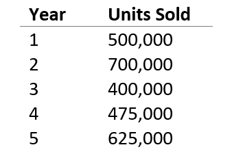
The mean is 540,000 (the sum of the units sold divided by 5). It gives equal weight to the top values, so if 2021 was a particularly bad year for ABC due to chip shortages, this will bring down the average substantially.
In a standard pay equity study, we typically calculate the mean of the pay for females and males and for racial minorities and non-minorities for comparison. Remember, this is just the standard average of pay without controlling for any variable that determines pay. For this reason, when we compare these, we often refer to the analysis as the raw or uncontrolled pay gap.
Median is simply the middle value in a list of numbers. Suppose Company ABC also wants to understand their median sales over the five-year period. To find out, we need to first sort the list with the units sold arranged from smallest to largest.
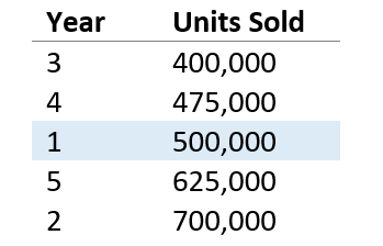
As the table shows, the median (or middle) value is 500,000 units, which was achieved in year 1. Note that unlike the mean, a particularly good or bad year would have little or no impact on the median.
In a standard pay equity analysis, we also look at the pay of the median female vs. median male pay and median racial minority pay vs. median non-minority pay. Since the mean (or average) can sometimes be biased by the pay of a few employees on either end of the spectrum, the median can be an additional way to gauge pay equity.
While mean and median describe the middle of a data set, distributional statistics are ways to understand how the overall data looks.
In statistics, standard deviation refers to the amount of variation or dispersion of a set of numbers around the mean. In other words, it’s the distance from the mean. Standard deviation is represented by the Greek letter sigma (σ) and is calculated based on the distance of each data point from the average.
If we calculate the standard deviation of the car sales for Company ABC, it comes out to be 120,675. A simple rule of thumb is that around 95% of a typical dataset is within two standard deviations of the mean.[1] In other words, if the standard deviation were 1,000, we would expect to see very little movement from year to year or we would expect to see the observations clustered around the mean. If it were 50,000, this means that the observations are spread away from the mean and we would accept big changes as perfectly reasonable.
A probability distribution function, or PDF, curve is the graphical representation of probability distribution of the observations. In short, the area under the curve reflects the probability of an observation being in that range. Taller areas reflect more likely outcomes while shorter areas reflect a wide range of numbers to capture a percentage of the distribution.
Figure 1 shows a normal distribution, which is symmetrical. It’s also called a bell curve, and is very frequently seen in data. Most of the data in a normal distribution is clustered around the mean. The further a value is from the mean, the less likely it is to occur. For a perfect normal distribution:
For those involved in six sigma, you may note that about 1 in 1 million observations falls more than 6 standard deviations (or 6 sigma) from the average.
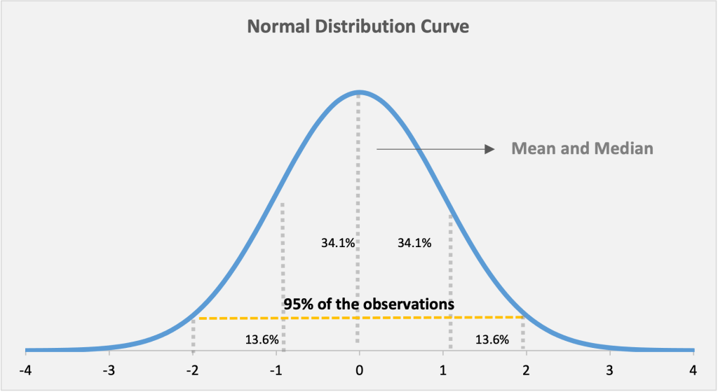
Figure 1: A normal distribution curve showing the distribution of observations around the mean. Approximately 95% of the population is within 2 standard deviations of the mean, while 5% is further out
Mean is just one of the parameters that determines a normal distribution. The other parameter is standard deviation. A larger standard deviation results in a wider curve, but the amount of the distribution within each standard deviation range is identical.
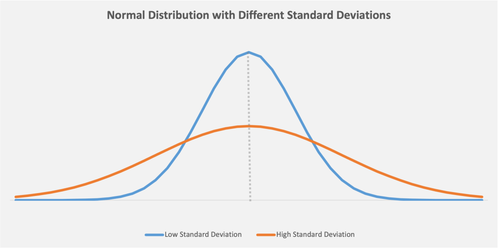
Figure 2: Low standard deviation, meaning the data is clustered around the median. This leads to a curve with a higher peak (the blue bell curve). High standard deviation means that the data is spread away from the mean, which leads to a curve with a flatter, broader peak (the orange curve)
A measure of the data’s symmetry, skewness tells us if there’s more of a tail, or distributions farther from the average on either side of the distribution. Pay data for an organization tends to skew right. The reason is that many employees may be paid at the bottom, or left side, of the distribution, none are paid zero or less than zero, and a select few have quite high pay.
As Figures 3 and 4 show, symmetric distributions will have the same mean and median, while a skewed distribution will have a mean different from the median based on the skew. A distribution with a large negative skew will have a left tail, whereas a distribution with a large positive skew will have a right tail.
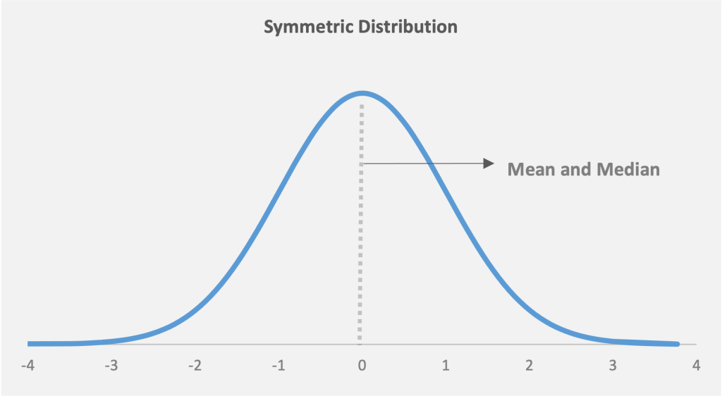
Figure 3: A symmetric data distribution, with the same mean and median
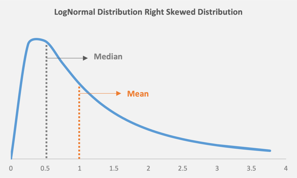
Figure 4: A skewed distribution, with the mean different from the median. In a right-skewed distribution, the mean will be higher than the median
In a statistical analysis (including a pay equity analysis), it’s important to work with data that’s close to normal after controlling for our factors in pay, and skewness can bias the results. To adjust for this, the log function is commonly used to convert a skewed distribution into a symmetric distribution.
The core objective of statistics is using the numbers to drive meaningful conclusions and insights about the data. Two typical methods for this are based on confidence/prediction intervals and hypothesis testing.
A confidence interval is a range of certainty that a parameter (often the mean) will fall between a pair of values around the mean. This is also often referred to as a margin of error. For example, based on the car sales data, we may be able to say we are 95% certain that the average sales over time will be between 480,000 and 600,000.[2] The probability limit can be set to any number, with the most common being a 95% or 99% confidence level.
A prediction interval is a range of certainty that a prediction will fall between a pair of predicted values around the mean. For example, we could say we’re 95% certain that the sales next year will be between 360,000 and 740,000. The probability limit can be set to any number, with the most common being a 95% or 99% prediction level.
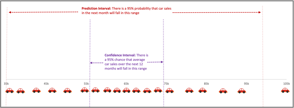
Figure 5: Upper and lower prediction intervals, with confidence interval
How Confidence and Prediction Intervals Compare
A confidence interval is used when trying to find a population parameter, such as the average. A prediction interval is used when trying to predict where a single observation will lie. The prediction interval will therefore be wider than the confidence interval. Both confidence and prediction intervals are made smaller if there are more observations and a lower standard deviation among observations.
This is a statistical test set to determine whether the data supports a given conclusion. For example, we may test whether the long-term average sales for our car dealership are equal to 450,000 or greater than 600,000.
In a pay equity study, the hypothesis being tested is that pay for men and women, or minority and non-minority, in the firm is the same after controlling for relevant factors. Importantly, we can never conclude whether a gap exists. Instead, the test rests on the likelihood of finding the data we did if there is no gap. The multivariate regression model then tests whether there is strong evidence to disprove this hypothesis. There are two possible, as Figure 6 shows.
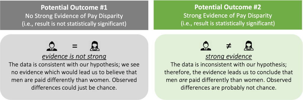
Figure 6: Two possible outcomes from a tested hypothesis
These outcomes link back to confidence intervals. If a gap of zero falls outside of the confidence interval, we find the evidence is strong.
Statistical significance is a way of stating that we find strong evidence of an outcome in a statistical analysis. It doesn’t imply that a number is concerning, and the lack of statistical significance doesn’t mean it’s not. Instead, it just indicates whether we can conclude that the differences aren’t due to random noise in the data.
Confidence level shows how sure we need to be to conclude that a result is statistically significant. In pay equity and other social science analyses, we ordinarily use a 5% likelihood. This means that 1 in 20 studies would result in a “false positive” conclusion of no equity when the population is balanced. A higher confidence level also increases the width of the confidence interval and thus the likelihood of a “false negative,” where we fail to identify a problem that exists.[3]
The p-value is how likely we are to find a value at least as extreme as what’s in our analysis, given the null hypothesis is true. For example, in the case of Company ABC, we may see a 1% likelihood of the average sales being over 600,000. With that, we would conclude that the average sales figure is below 600,000 and this is statistically significant.
In a pay equity study, if we see a gap of 2% between male and female wages, and the p-value is 10%, that means the result isn’t statistically significant (although we can’t say there isn’t a gap).
A T-test is for seeing whether the average from two groups is the same. Importantly, this test doesn’t include any controls. But it can be used to see if car sales in July and August over the past 30 years are the same, or if the average male and female income in a certain group is the same.
When we look at pay equity, we aren’t looking simply at a single variable. Rather, we want to look at the relationship between multiple variables—specifically pay and variables such as role, experience, and performance. Regression analysis is the primary method to test for pay equity. These tools, which relies on looking at how variables move together, allow us to model employee pay using a series of predictive variables.
Correlation is a statistical measure establishing the magnitude and the direction of the relationship between two variables. For instance, the variables could be discount and car sales, where the greater the discount, the higher the car sales. Correlation is measured by the correlation coefficient (r) and can fall anywhere in the range between +1.0 to -1.0.
When the correlation coefficient is 0, it indicates there’s no relationship between the variables (one variable can remain constant while the other increases or decreases).
If the correlation coefficient has a negative value (below 0), it indicates a negative relationship between the variables. This means that the variables move in opposite directions (i.e., when one increases the other decreases, or when one decreases the other increases).
If the correlation coefficient has a positive value (above 0), it indicates a positive relationship between the variables. That means both variables move in tandem (i.e., as one variable decreases the other also decreases, or when one variable increases the other also increases). In a pay equity study, most of the variables used to explain pay tend to be positively correlated with pay. Figures 7 and 8 show what the data for two variables with a positive correlation can look like.
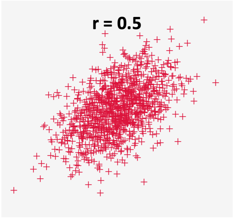
Figure 7: Scatter plot for two variables that are not so highly correlated
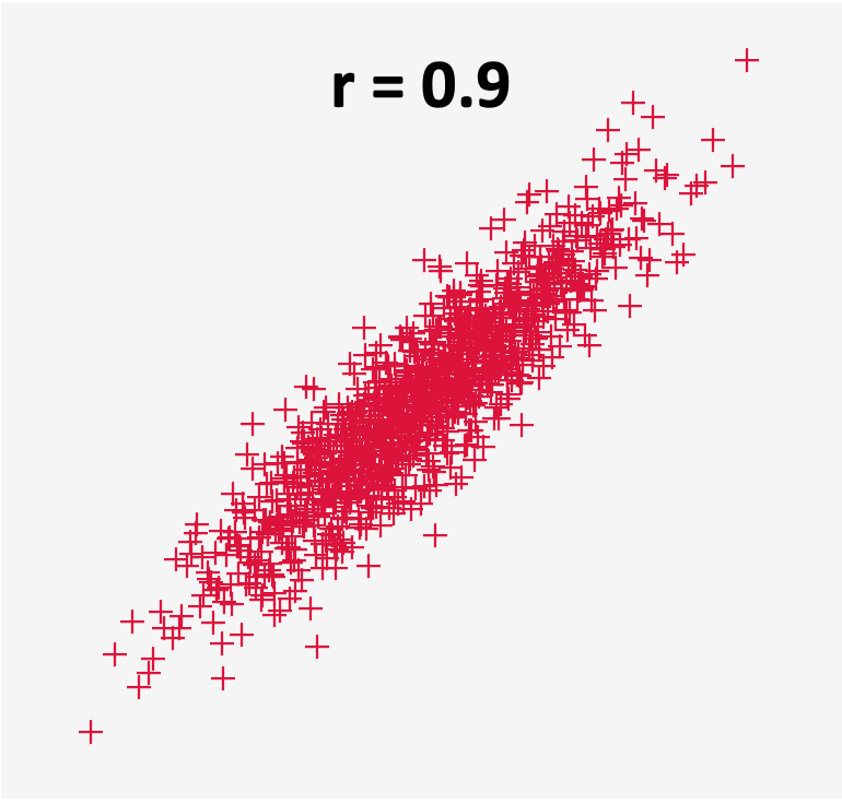
Figure 8: Scatter plot for two variables that are highly correlated
One of the most widely used statistical tool to conduct a pay equity study is regression analysis. Regression analysis is a class of statistical tools that allows analysts to analyze one variable by controlling for differences among other variables.
A regression analysis is how one controls for various independent variables to predict the outcome of the dependent variable.
In a pay equity study, think of regression analysis as the mechanism through which all the moving parts that affect pay (role, performance, location, etc.) are simultaneously taken into consideration. The aim is to quantify whether any remaining differences in pay can be linked to inappropriate factors like gender and ethnicity.
Regression finds a “best fit” line through a set of data. The goal is to explain the dependent variable (pay, in the case of pay equity study) in the context of independent variables like role, experience, performance, and location that are believed to impact pay. The regression shows how pay varies in response to changes in the latter. In designing the model, the hope is that it finds no evidence of a factor like gender or ethnicity explaining pay differences.
Let’s try to understand this concept with a simple example involving pay itself. Suppose a small company with only 20 employees has only one independent factor, tenure, that affects pay. The formula in Figure 9 illustrates how tenure is used in the regression analysis to explain pay.
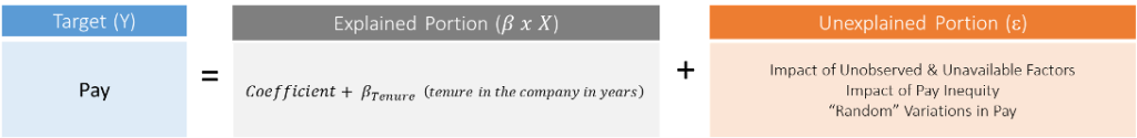
Figure 9: Tenure as an independent variable in a regression analysis
One can visualize the above equation on a regression plot. In Figure 10, each employee is plotted as a blue point along axes of tenure (horizontal) and pay (vertical). A simple regression on these variables results in a straight line being drawn through the scatterplot, which most closely cuts through the points and minimizes outliers. This line is shown in orange and illustrates the predicted pay level for each tenure.
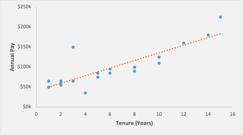
Figure 10: A scatterplot and regression line for a univariate regression
If we think back to our high school algebra classes, this line is a classic y=mx + b, or slope-intercept concept.
The particular equation for the line shown above is: y=39.83+9.56x , where:[4]
This is a simple example with only one independent variable. In reality, there can be multiple factors (independent variables) influencing pay. In such cases, the regression equation can be expanded using the coefficients of the respective variables.
In a regression analysis, the main variable that we are trying to predict or understand is called the dependent variable. This is also called the target variable, or the Y variable based on the graphing convention of putting these on the vertical axis. It’s often easiest to remember that this is the variable that depends on the other ones. Typical dependent variables may be where a stock price should be, tomorrow’s weather, or a student’s test score.
For a pay equity study, the dependent variable would be the one used to understand and predict an employee’s pay.
In a regression analysis, the factors that we suspect can have an impact on the dependent variable are called the independent variables. These are also often called explanatory, predictor, or X variables.
In a pay equity study, these are the factors that we think can potentially impact pay. A non-comprehensive list could include job role, prior work experience, tenure at the company, tenure in the current role, location/cost of living adjustment, performance rating, education, travel requirements, and supervisory responsibility.
In a regression analysis, explanatory variables can be either numeric or categorical:
A dummy or indicator variable is a numeric variable that represents categorical information. These are binary—that is, they can have two possible values. In our car example, we could look at daily sales and use rain as a dummy variable to test if people are less likely to buy cars when the weather is bad. In our pay equity analysis, a dummy variable for gender can have a value of either 0 or 1 (representing male and female). Therefore, for the variable representing gender, each record in the data will have a value of either 0 or 1.[5]
In real-life datasets, the distribution doesn’t always lend itself to regression. It’s often skewed, which could lead to invalid regression results. For example, imagine if we’re regressing animals’ brain size on their body weight. In this case, the error from an elephant may be much bigger than a mouse’s whole body.
When the distribution has an issue where bigger observations seem to be further spread out,[6] we can normalize the distribution so that the results become more valid. Log transformation helps to reduce noise and the skewness in the data to make the regression results statistically valid
You may remember from school the standard log (base 10) function:
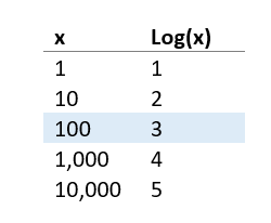
In our analysis, we do the same but use Euler’s number, approximately 2.718, typically known as “e”,[7] as the base due to some convenient statistical properties. From the result, you can consider the difference in log outcomes as reflective as the percentage change in x.
In a pay equity study, the dependent variable (pay) is expected to largely follow a skewed distribution with no one making less than $0, a large set of lower paid employees, and a few very highly compensated employees the top of the distribution. Using a logarithmic transformation of pay helps remove this skewness and provide for a regression that meets the underlying data assumptions (which are well beyond the scope of this primer).
After designing and running the final regression, our model gives us different outputs. Here, we focus on some of the key ones that will come up in our analysis.
This is the impact of each of our x variables in the regression. In our earlier equation, y=39.83+9.56x, let’s assume that y is the pay and x is the tenure. As such, the coefficient for tenure in this equation is 9.56 . This means that if tenure goes up by 1 year, our expected value for y (pay) will go up by 9.56.
In addition to experience, a pay equity study can have different variables that impact pay (like location, education, performance ratings, supervisory responsibilities, management level, etc.) The regression model generates coefficients for each of these independent variables to help determine their impact on pay.
While we’re discussing coefficients and variables in regression, it would be useful to discuss indicator or dummy[8] variables. The effect of a dummy variable where x is equal to 0 or 1 is two different regression lines, one for the control group and one for the test group separated by the coefficient. In a pay equity analysis, the critical hypothesis test is that the impact of a gender dummy is zero. If we find evidence that this isn’t the case and gender indicator actually has an effect in the regression, then this shows a gap in pay based on gender (see Figure 11).
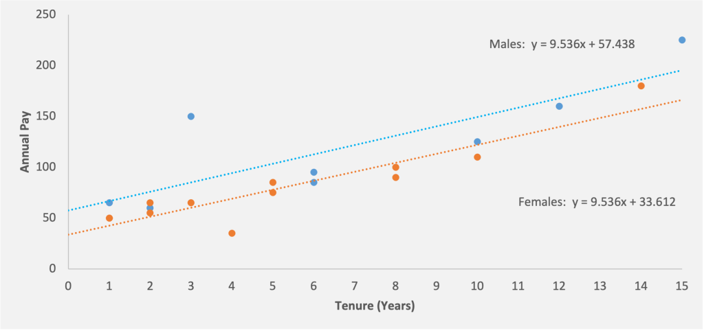
Figure 11: Two different regression lines for male and females. Based on the above regression equation, a woman with five years of experience would be expected to be paid $81,292 while a man with the same experience would be expected to make an additional $23,826, or a total of $105,118
In a linear regression model, R-squared value is the measure of the “goodness of fit” of the model. This determines how well the model fits the data, or otherwise stated, how much of the differences are explained by our x-variables.
The value of R square can range anywhere between 0% -100%. A lower R-squared represents high variance between the fitted values and the data points and vice versa. The visual plots below illustrate a higher and lower R-squared.
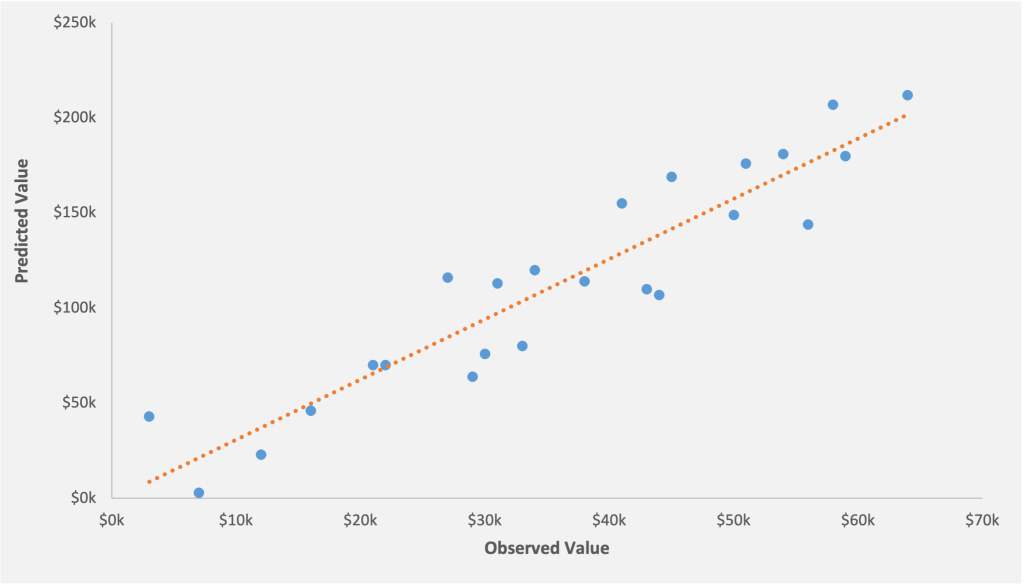
Figure 12: The R-squared for the model 86%. Most of the data points are clustered around the regression line. The model can explain 86% of the variance and therefore is a better fit
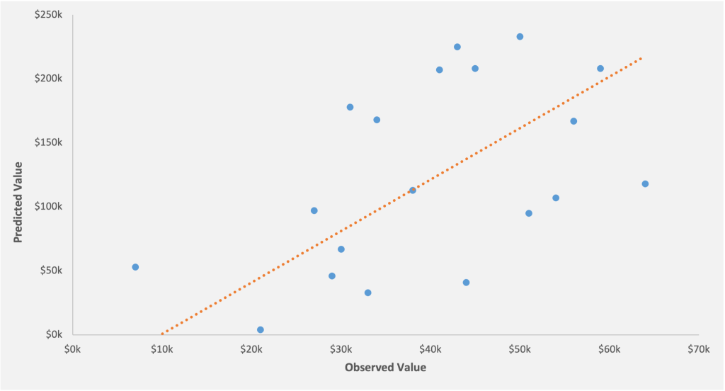
Figure 13: The R-squared for the model 53%. A large number of data points are scattered away from the regression line, which means that the model can explain only 53% of the variance
Is a low R-squared value an issue?
Not necessarily! It depends on various factors like the kind of analysis, the sample size, and the number and kind of independent variables. Studies on weather patterns will tend to have lower R-square relative to car sales because weather is harder to predict than car sales. Similarly, if a regression study has a number of independent variables whose impact is unclear or difficult to predict, then it’s expected that the model will have low R-square.
If we’re using a large number of independent variables in a regression model for a small sample size, then the R-squared could be very high. In fact, adding additional variables will only make the value higher. However, this could possibly indicate a model over fit issue, which is not ideal.
It’s therefore important to check the p-value of the estimates of the variables themselves. If the variables themselves are statistically significant, then the model is possibly a good predictor of the dependent variable, irrespective of the R-squared value.
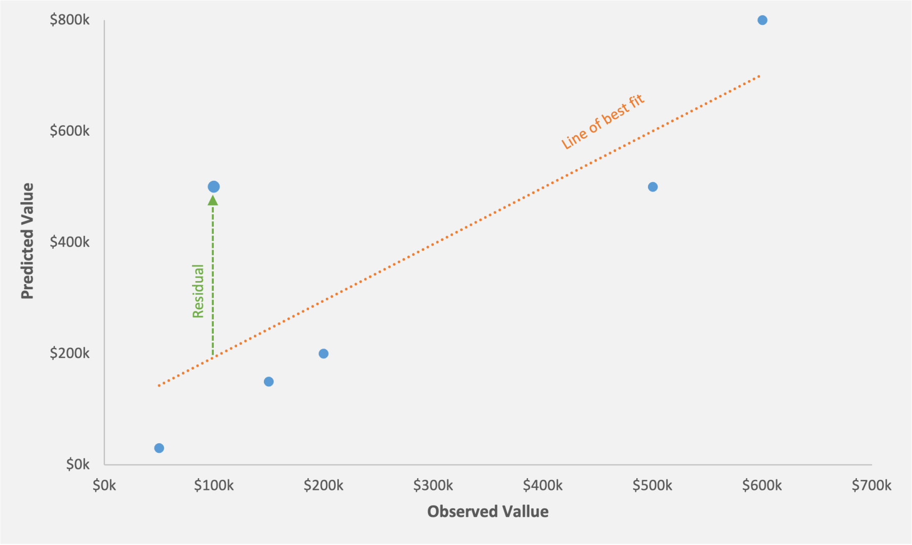
When we perform a regression analysis, we get a line of best fit. The different data points are scattered around the line of best fit. Residual is simply the vertical distance between the data point and the line of best fit. In other words, it’s the difference between the observed value and the predicted value.
In figure 14 the dots above the line of best fit indicates positive residual. For these data points, the predicted value is higher than the observed value. The dots below the line indicates negative residual. For these data points, the predicted value is lower than the observed value.
The regression analysis also informs us about the outliers. Outliers are the observations that fall outside the predicted range from the regression model. In other words, they’re the observations that don’t fit the model well, such as those with an unexpectedly high or low value. Statistically stated, an outlier is an observation value that falls outside of the relevant prediction interval, or an observation with a p-value of 0.05 or less.
In our pay equity context, the regression generates the predicted pay value for each individual and a corresponding prediction interval. People whose actual pay falls outside this predicted range are then flagged as outliers. These are employees we identify for further consideration or remediation. Because the p-value reflects random variability in the data, we expect about 5% of the population to be outliers.
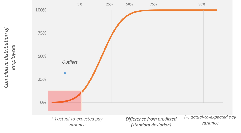
Figure 15: A cumulative distribution graph where the x-axis shows how far off actual pay is from its expected level. Negative outliers are the bottom 5% and positive outliers are the top 5% of the probability distribution. In this regard, the region to the left of the vertical median (50%) dividing line shows cases where actual pay falls below expected pay, and cases to the right involve actual pay exceeding expected pay
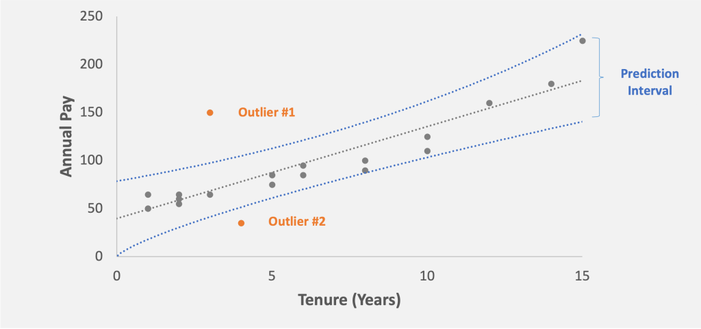
Figure 16: Outlier #1 and Outlier #2, two employees whose pay is outside the prediction interval of 90%. Outlier #2 is paid above than the predicted range and Outlier #1 is paid below the predicted range
In a regression analysis, there are several other terms and tools that might come up. The tools to be used depends on the purpose, goal, and depth of the study. Therefore, there’s no single model that fits all requirements. More often than not, the models need to be customized so they can help explain the variations and the observations in the data in a more robust way.
We hope you found this article helpful. If you have any questions about the topics we covered here, or about pay equity studies in general, we’d love to hear from you.
[1] Readers who are more statistically inclined may note that the 95% rule applies to data under the normal distribution, while 75% of the data falls within 2 standard deviations for all distributions.
[2] A selection of five data points typically isn’t enough to calculate a statistically reasonable confidence interval. Usually, a minimum sample size of 30 is relied upon. The reason for this isn’t statistical witchcraft. It’s that this amount of data lets us reasonably say the average is normally distributed using the central limit theorem.
[3] Much is made of the 95% rule. We tend to think of this as the notion of a reasonable doubt from a court case. Because social sciences contain data with more noise, we’re willing to accept small differences. The trade-off of more false positives is offset by a higher chance of finding issues. In manufacturing applications, this tolerance may go way down. For example, Lego states that fewer than one in a thousand sets are missing a needed piece. Customers may be unhappy if they got a complete set only 95% of the time. When manufacturing a space shuttle, failures can be set to one in millions.
[4] You may notice that in the commonly used “y=mx+b”, the x term is at the beginning, while in our regression the order is flipped. The simple reason is that for multiple regression, we have a number of x variables, and it is more convenient to put these together in order
[5] For employees with non-binary gender, we note that this isn’t typically specifically broken out in analyses due to the smaller number of employees. However, it’s also possible to use a separate indicator variable to capture multiple groups.
[6] The statistical term for this is heteroscedasticity, with hetero meaning different, and scedastic referring to errors.
[7] You can treat e like pi. It’s a mathematical “magic number” that has some great statistical properties. Euler’s (pronounced oiler’s) number, however, suffers from a lack of pi/pie jokes.
[8] “Dummy” refers to the fact that it’s an indicator, and makes no judgement on intelligence. With that said, it’s our practice to always assign males the dummy value.